
On Paper

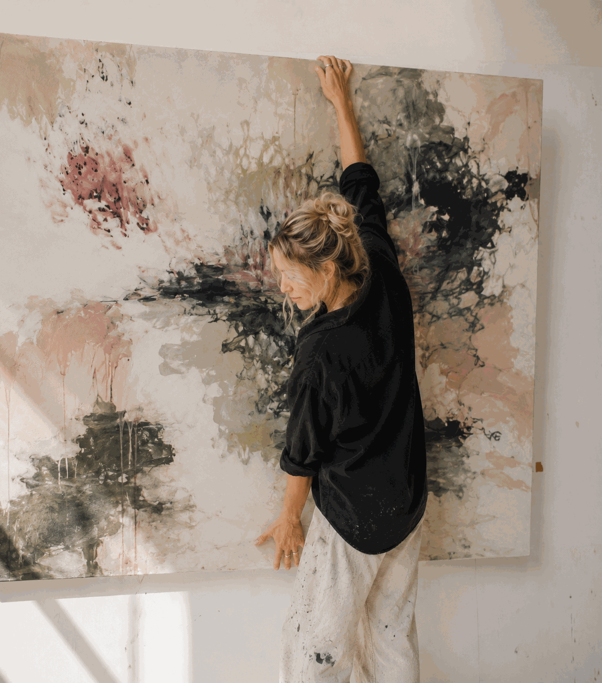
Artist Spotlight: In Conversation with Neve Calloway
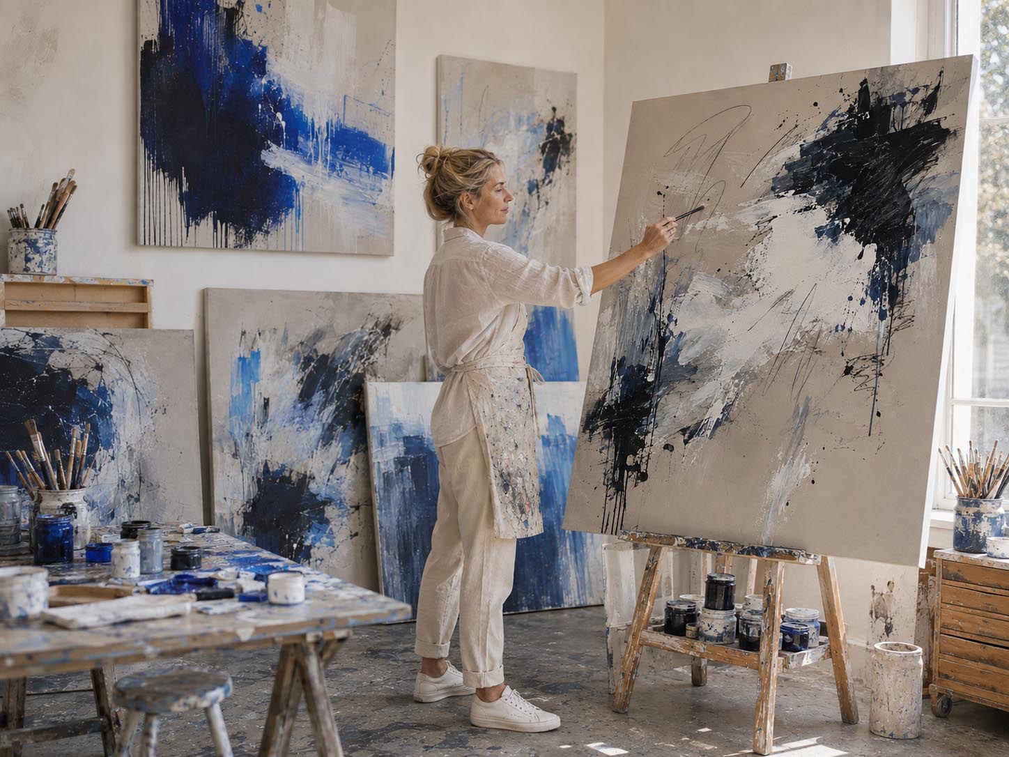
Before she ever had a full-time studio, Neve Calloway was painting theatre sets and murals for cafés and record stores — scrappy, make-it-work jobs that still shape how she approaches a canvas today. Her expressive, colour-driven abstracts are built fast, in layers, often revised dozens of times before she's satisfied. We caught up with her about process, colour, and the wall of paintings she isn't finished with yet. artfables curator: You spent your twenties doing odd creative jobs — set painting, murals for cafés and record stores. How did that shape the way you paint now? Calloway: Completely. When you're painting a mural on a deadline, or building a set that has to hold up under stage lights by Friday, you learn to work fast and trust your instincts, because there's no time to overthink it. That scrappy energy never really left me. I still paint that way — quickly, confidently, across the whole canvas at once rather than working one corner at a time. artfables curator: Your canvases apparently go through a lot of changes before they're finished. What does a piece look like halfway through? Calloway: Honestly, it can look like a completely different painting. I'll lay down a layer, live with it a while, then paint right over parts of it if it's not saying what I need. A piece might go through a dozen different versions of itself before I call it done. What you see at the end is really just the last decision in a long conversation with the canvas. artfables curator: You work with big brushes, palette knives, sometimes your hands. Why that approach? Calloway: I want as little distance as possible between what I'm feeling and what ends up on the canvas. Fine detail work has its place, but it's not mine — I'm after immediacy. Hands and big brushes and knives let me move fast and stay honest. If I overthink a mark, it usually shows. artfables curator: Tell us about the wall of "unfinished attempts" in your studio. Calloway: It's exactly what it sounds like — a wall of pieces I haven't given up on but haven't solved yet. I'll leave something there for months, sometimes longer, and come back to it once I've figured out what it's missing. Some of my favourite finished paintings sat on that wall for the better part of a year before I knew what to do with them. artfables curator: How do you choose colour? Do you plan a palette in advance? Calloway: Almost never. I don't paint a colour because it matches something. I paint it because the canvas asked for it right then. If I try to plan a palette ahead of time, the painting usually fights me. I'd rather respond in the moment and let the piece tell me what it needs next. artfables curator: What do you want someone to feel when they bring one of your paintings home? Calloway: I want it to have some energy in the room — something that doesn't just sit quietly in the background. My hope is that people notice something new in it every so often, long after they've hung it, the same way I kept noticing new things while I was making it. artfables curator: Any advice for someone just starting to collect, especially if they're drawn to colour-driven work like yours? Calloway: Trust the piece that actually stops you, not the one that seems safest. Colour is emotional — it hits people differently, and there's no universally "right" palette to collect. If a painting genuinely holds your attention, that reaction is worth more than any advice about what's supposed to work in a room. Discover the full collection by artist Neve Calloway exclusively to artfables
Learn more
How to Start an Art Collection: A Beginner's Guide
You don't need a gallery contact, an advisor, or a spare room to begin collecting art. You need a wall, a little patience, and a willingness to buy what you actually love before you worry about anything else. Here's how to start well. Buy what stops you, not what's trending The biggest mistake new collectors make is buying for someone else's taste — a colour scheme they read about, an artist everyone's mentioning, a piece chosen to impress a guest rather than to live with. Trends fade. Your own eye doesn't. If you stand in front of a piece and find yourself looking longer than you meant to, that's the signal worth following. Set a budget — and treat it as a floor, not a ceiling You don't need to spend a fortune to begin seriously. A single strong original or a well-chosen limited edition print, bought within a budget you're comfortable with, teaches you more about collecting than a dozen pieces bought on impulse. Decide what you're willing to spend before you start looking, and let that number narrow your search rather than limit your ambition. Understand what you're actually buying Before any purchase, ask a few simple questions: Is this an original or a print? If it's a print, is it a true limited edition — numbered, capped, never reprinted — or an open edition that can be produced indefinitely? Does it come with a certificate of authenticity? Who is the artist, and is there a consistent body of work behind this one piece? A source who can answer these clearly, without hedging, is a source worth buying from. Live with a piece before you chase the next one New collectors often want to fill every wall at once. Resist that. Bring a piece home, hang it, and give it a season before adding another. You'll start to notice how your taste is actually built — which colours you return to, which subjects hold your attention, which pieces recede into the background. That knowledge is worth more than any buying guide. Let your collection tell a story, not match a palette A collection isn't a furniture set. It doesn't need to match. The most interesting collections, built over years, tend to hold together not because every piece shares a colour palette but because every piece was chosen with the same honesty — bought because it meant something, not because it fit. Mix mediums. Mix artists. Let the collection reflect how your eye has changed over time, because it will. Start small, start now The collectors who end up with the most interesting walls almost never started with a plan. They started with one piece they couldn't stop looking at, and let the rest follow. That's the only real first step — everything else is refinement.
Learn more
Top 10 Limited Edition Prints to Elevate Your Home
Building a collection doesn't mean starting with an original — for many collectors, a limited edition print is the first step into a lifelong relationship with an artist's work. Each print in the artfables collection is produced in a strictly numbered run of 150, never reprinted once the edition closes, so what you're bringing home isn't a poster — it's a considered, finite piece of a larger body of work. Here are ten prints from the collection worth knowing, and why each one earns its place on a wall. 1. Spill The Beans — Danny Cruz — £265 A stylised, retro colour-block take on a Heinz Beanz can — Pop Art built from the everyday, not the exotic Bold and saturated, making it a natural focal point in a kitchen, hallway, or home office A good entry point for a collector who wants a piece with personality and craft, not just colour Best hung as a single statement piece rather than grouped 2. Rhythm 3 — Femi Okoro — £300 A grid of organic, loop-like gestures in black, brown, and beige Carries real motion — the rhythm of the artist's hand is visible in every repeated form Suits a hallway, staircase, or transitional space that benefits from directional energy Neutral enough to sit comfortably alongside warmer or cooler palettes elsewhere in the room 3. It Will Be Okay Again — Ingrid Solberg — £250 An impressionistic, cloud-heavy sky over calm water, rendered with real atmospheric weight Quiet and contemplative — a strong choice for a bedroom, study, or reading corner Pairs naturally with natural materials — linen, raw oak, stone Part of a loose two-piece pairing with "It Will Be Okay," for a collector who wants to build a themed grouping 4. I Will Remember You — Sarah Whitfield — £350 Textured, layered brushstrokes in beige, black, brown, and soft pink Earthy rather than sweet — the pink reads as considered, not decorative Suited to a living room or bedroom where you want warmth without an obvious focal colour A strong choice for a collector building toward a more textural, tactile wall 5. Hide & Seek — Théo Marchand — £350 A modern concrete building façade abstracted into clean geometric form Structured and architectural — a deliberate contrast to softer, more painterly work elsewhere in a home Ideal for an entryway, office, or any space with strong existing architectural lines Reads equally well in a modern apartment or a converted industrial space 6. Waiting For You — Rosa Adair — £300 A misty, abstracted coastal scene in muted grey, beige, and blue Atmospheric rather than literal — it suggests a place without depicting one directly A natural fit for homes near water, or simply for collectors drawn to a cooler, more reflective palette Complements raw wood, stone, and unbleached linen 7. Crator — Otto — £225 Expressive black-and-white brushstrokes over a warm beige ground Confident and gestural, with the negative space doing as much work as the mark itself A favourite for collectors building toward a more monochrome, gallery-style wall Scales well — strong as a single piece, equally effective as part of a grouping 8. Eyes Closed — Neve Calloway — £190 Soft, painterly brushwork in teal, pink, peach, and cream Built from fast, intuitive layering — the immediacy of the process is visible in the finished piece Brings warmth and movement to an otherwise neutral or minimalist room One of the more approachable entry points in the collection, both in price and mood 9. Stillness — Mireille Laurent — £290 Vertical brushstrokes in beige, cream, white, black, and soft green Restrained and unhurried, with a quiet, almost meditative rhythm to the composition Well suited to a bedroom or reading nook — a piece to be lived with rather than noticed all at once A strong choice for a collector who wants abstraction with a calmer, more classical foundation 10. The House II — Kate Stone — £185 Blocks of beige, taupe, black, and grey arranged into clean, minimal geometry Precise and architectural — a deliberate counterpoint to the more painterly pieces on this list Suits a study, office, or any space where you want structure without noise Pairs particularly well with Théo Marchand's "Hide & Seek" for a collector building a geometric grouping Choosing Between Them Rather than starting with "what matches my sofa," start with which of these ten pulls you back a second time. A limited edition print is meant to be lived with, not just placed — and with only 150 numbered pieces in each run, the ones that speak to you now won't be available indefinitely. Each print listed here is part of a numbered, closed edition. Once a run of 150 is complete, it will not be reprinted. Discover the full collection of limited edition prints
Learn more
5 Ways To Choose Art For Your New Home
Moving into a new house or wrapping up a renovation is exciting — but there's often one room-by-room decision that gets left for last: the art. Blank walls can make even a beautifully finished home feel unfinished. The good news is that choosing art doesn't have to be overwhelming. Here are five practical ways to pick pieces that feel intentional, personal, and right for your space. 1. Start With the Mood You Want to Create Before you fall in love with a single piece, think about how you want each room to feel. A bedroom might call for soft, calming tones and quiet compositions, while a living room where you entertain guests could handle bolder colours or a striking statement piece. Walk through your home room by room and jot down one word for the mood you're after — "restful," "energetic," "warm," "airy." Let that word guide your choices instead of shopping randomly and hoping things fit later. 2. Let Your Existing Palette Lead the Way Your new home already has a colour story, whether it comes from your walls, flooring, furniture, or natural light. Rather than choosing art in isolation, pull two or three key colors from your space — a rug, a couch, a tile backsplash — and look for artwork that either echoes those tones or offers a deliberate, complementary contrast. This doesn't mean everything needs to match perfectly; a little tension between art and decor can actually make a room more interesting. The goal is coherence, not uniformity. 3. Think About Scale Before Subject Matter One of the most common mistakes people make is choosing art that's too small for the wall it's meant to fill. A general rule of thumb: art should take up roughly 60–75% of the width of the furniture it hangs above, like a sofa, console table, or bed headboard. For large, empty walls, consider an oversized single piece, a diptych or triptych, or a gallery wall of smaller works arranged together. Measure your wall space first, then shop — it will narrow your options and save you from a piece that gets lost or overwhelms the room. 4. Choose Pieces That Reflect You, Not Just a Trend It's easy to default to whatever's popular at the moment, but art you'll love for years should say something about you — your travels, your interests, a colour you're drawn to, a memory you want to hold onto. Mix it up: original paintings, photography, prints, textiles, or even meaningful objects framed as art all count. A home feels most finished when the art on the walls tells a story that's actually yours, rather than one borrowed from a showroom. 5. Buy Once You're Living in the Space It's tempting to shop for art before you've even moved in, but rooms often reveal themselves differently once you're actually living in them. Natural light shifts throughout the day, furniture gets rearranged, and your sense of how a room is used can change. Give yourself a few weeks to settle in before committing to major art purchases. Blank walls aren't a failure — they're an invitation to choose thoughtfully instead of quickly. A Quick Word on the Rest of Your Decor Art doesn't exist in a vacuum — it works best as part of a considered whole. As you settle into your new or renovated home, keep these finishing touches in mind: Sofas: Your sofa often anchors the whole room, so choose it before finalizing smaller decor. Prioritise comfort and durable, easy-to-clean fabric if you have kids or pets, and pick a neutral base if you plan to change accent colors often. Lighting: Layer your lighting with a mix of overhead fixtures, table lamps, and floor lamps rather than relying on one central light. Warmer bulbs (around 2700K–3000K) tend to create a cosier atmosphere in living spaces and bedrooms. Rugs: A rug should be large enough that at least the front legs of your furniture rest on it — too small a rug can make a room feel disjointed. Choose materials suited to the room's traffic, like wool or synthetic blends for high-use areas. Decorations: Smaller touches — vases, books, candles, plants, and trays — help tie a room together once the big pieces are in place. Add them gradually rather than all at once, and don't be afraid to leave a little visual breathing room. Furnishing and decorating a home is rarely a one-weekend project — and that's okay. Take it room by room, trust your own taste, and let your space evolve naturally over time.
Learn more
Exploring Unique Styles in Cool Art Prints
In the world of interior design, art prints offer a simple yet profound way to transform any space. Whether you're a seasoned art collector or someone who just wants to add a splash of personality to your home, cool art prints can be the perfect solution. This article will guide you through various unique styles in modern art prints and how to choose the right ones for your space. Understanding the Appeal of Unique Wall Art Unique wall art is more than just decoration; it’s an expression of individuality and taste. When you choose art for your walls, you’re selecting pieces that resonate with you personally, and that can evoke emotions or provoke thought. Let's dive into why unique art prints hold such an appeal. Personal Expression Art prints are a form of self-expression. They allow you to showcase your personality and interests without uttering a word. Whether you prefer abstract designs, minimalistic patterns, or vibrant colors, there’s a piece out there that reflects your essence. Endless Variety The beauty of art prints lies in their diversity. From modern art prints to more traditional landscapes, the range of styles, colours, and themes is nearly limitless. This variety means you can find the perfect piece to complement your home’s aesthetic, whether it’s a chic urban loft or a cozy cottage. Exploring Different Styles of Modern Art Prints Modern art prints encompass a wide range of styles, each offering something unique. Here, we explore some of the most popular styles that are making waves in interior design. Abstract Art Prints Abstract art is characterised by its use of shapes, colors, and lines to create compositions that may not resemble real-world objects. These prints are perfect for adding a touch of mystery and intrigue to your space. An abstract piece can serve as a bold focal point in a room or complement other elements of your decor. Minimalist Art Prints Minimalism is all about simplicity and clarity. Minimalist art prints often feature clean lines and a limited color palette, making them ideal for modern and contemporary spaces. They bring a sense of calm and order to a room, which can be particularly appealing in today’s fast-paced world. Pop Art Prints Pop art is a fun, energetic style that draws inspiration from popular culture. These prints often feature bright colors and bold graphics, making them perfect for adding a playful touch to any room. Pop art can also serve as a nostalgic nod to past decades, adding an element of retro charm. Nature-Inspired Prints Nature-inspired prints bring the beauty of the outdoors inside. Whether it’s a serene landscape, a vibrant floral piece, or an abstract interpretation of natural elements, these prints can create a peaceful and inviting atmosphere in your home. Choosing the Right Art Prints for Your Space Selecting the perfect art prints for your home involves more than just picking something you like. Here are some tips to help you make the right choice. Consider the Room’s Purpose The function of the room should guide your art selection. For example, calming prints are ideal for bedrooms, while vibrant, dynamic pieces might be better suited for a living room or kitchen where you entertain guests. Match Your Colour Scheme While art should stand out, it should also complement your existing color palette. Look for prints that incorporate the colours already present in your room, or choose a piece that introduces a new hue that complements your decor. Size and Placement Matter Consider the size of the wall and the scale of the furniture around it when choosing art. Large prints can make a statement on a big wall, while smaller pieces work well in more intimate spaces or as part of a gallery wall. Trust Your Instincts Ultimately, art is a personal choice. Trust your instincts and choose pieces that you connect with. Whether it’s the color, the style, or the subject matter, ensure the art you select speaks to you. Trends in Cool Art Prints The art world is constantly evolving, and staying on top of trends can help you find pieces that feel current and fresh. Here are some trends in cool art prints that are gaining popularity: Geometric Patterns Geometric patterns are a staple in modern design. These prints often feature bold shapes and lines, creating a sense of order and symmetry that can be both soothing and visually stimulating. Black and White Prints Black and white prints are timeless and versatile. They can add a touch of elegance and sophistication to any room and work well in both traditional and modern settings. Mixed Media Prints Mixed media art combines different materials and techniques, resulting in unique and textured prints. These pieces often have a three-dimensional quality that adds depth and interest to your walls. Art prints offer an accessible way to enhance your home’s aesthetic while expressing your personal style. From unique wall art to modern art prints, the options are endless. By considering the purpose of your space, matching your colour scheme, and trusting your instincts, you can find the perfect art prints to elevate your home decor. Whether you’re drawn to abstract designs, minimalist styles, or vibrant pop art, there’s a cool art print out there that’s just right for you. By exploring and experimenting with different styles, you’ll not only beautify your living space but also create an environment that reflects who you are. Happy art hunting!
Learn more
How to Hang and Display Gallery Walls at Home
Creating a gallery wall is a simple yet impactful way to personalise your home and showcase your favourite artwork, photos, and decorative pieces. Whether you’re styling a small nook or an expansive wall, these tips will guide you through the process of designing and hanging your gallery wall with ease and confidence. Step 1: Plan Your Layout Before you start hammering nails into your wall, take the time to plan your gallery. Consider the following: Choose a Theme: Decide on a cohesive theme or colour palette for your wall. This could be family photos, abstract art, botanical prints, or a mix of styles that complement each other. Measure Your Space: Use a tape measure to determine the dimensions of the wall area you’ll be working with. This will help you create a balanced arrangement. Gather Your Pieces: Collect all the items you plan to include. These might include framed photos, art prints, mirrors, or even small shelves for three-dimensional objects. Step 2: Create a Mock-Up To visualise your gallery wall before committing to a layout: Use Paper Templates: Cut pieces of kraft paper or newspaper to the size of each item you plan to hang. Tape them to the wall with painter’s tape to experiment with different arrangements. Start at Eye Level: Arrange the main focal point of your gallery at eye level. Build the rest of the layout around it, ensuring there’s a consistent spacing between each piece (typically 2-3 inches). Balance Shapes and Sizes: Mix different frame sizes and orientations to create visual interest, but maintain a sense of balance. Step 3: Prepare Your Wall Once you’re happy with the layout, it’s time to prepare your wall: Mark Your Spots: Use a pencil to lightly mark where each nail or hook will go. If you’re using a level, ensure everything is aligned. Choose the Right Hardware: Use nails, picture hangers, or adhesive hooks appropriate for the weight of your frames. For heavier pieces, consider wall anchors. Protect Your Wall: If you’re renting or want to avoid permanent marks, opt for removable adhesive strips designed for hanging pictures. Step 4: Hang Your Pieces Now it’s time to bring your gallery wall to life: Work From the Center Out: Start by hanging the central piece and work outward to maintain balance. Check Your Progress: Step back frequently to assess the overall look and make adjustments as needed. Ensure Stability: Double-check that each piece is securely hung and straight. Step 5: Add the Finishing Touches Once everything is in place: Layer Decor: Enhance your gallery wall with complementary decor, such as a nearby plant, a console table, or accent lighting. Experiment: Don’t be afraid to swap pieces out over time to keep the display fresh and reflective of your evolving style. Bonus Tips Stick to Odd Numbers: Odd numbers of items often create a more dynamic and visually appealing arrangement. Incorporate Textures: Mix frames with different materials, like wood, metal, or acrylic, to add depth. Use Personal Touches: Include meaningful items, like travel souvenirs or children’s artwork, for a unique and heartfelt display.
Learn more
Step-by-Step Guide to Using Command Strips to Hang Art
What Are Command Strips? Command Strips are adhesive strips designed to allow you to hang items on the wall without using nails or screws. The strips consist of two parts: one that sticks to the wall and another that adheres to the object you're hanging. Once you’re ready to remove them, they come off cleanly without damaging the surface, making them perfect for renters or anyone who wants a damage-free solution to hanging items. Benefits of Using Command Strips: Damage-Free: No holes, marks, or sticky residue left behind. Easy to Use: Simple to apply and remove. Versatile: Works on a variety of surfaces such as drywall, tile, metal, and wood. Adjustable: Can be repositioned before you press them fully in place. No Tools Required: No need for hammers or drills, making them safe for people who aren't comfortable with traditional hanging methods. Now, let’s walk through the steps to use Command Strips to hang your artwork! Step 1: Gather Your Materials Before you start, gather everything you need: Command Strips (Make sure to choose the ones rated for the weight of your artwork.) Your artwork Measuring tape or ruler Level (optional, but highly recommended for straight placement) Step 2: Determine the Placement on the Wall Before applying the Command Strips, decide where you want the canvas to be placed. This is a crucial step since it’s easier to adjust things now than after the strips are stuck to the wall. Measure the centre of the wall to make sure the artwork is aligned properly. Use a level to ensure your marks are straight. Mark lightly with a pencil where the top of the canvas will be. Step 3: Prepare the Command Strips Each set of Command Strips usually has two pieces: one for the wall and one for the canvas. Depending on the size of your canvas, you’ll need to use more strips for heavier artwork. For a large canvas, use 4-6 strips (one on each corner or as recommended for the weight of the artwork). Separate the strips from the backing but don’t remove the adhesive protective strips just yet. Press the strips together (one part on the wall, one part on the back of the frame). Step 4: Attach the Strips to the Canvas Place the strips on the back of the canvas. Ensure the adhesive side is facing the wall side and stick them close to the edges, particularly on the top corners of the canvas or framed artwork. This ensures even weight distribution. Press firmly for 30 seconds to ensure a strong bond. Step 5: Position the framed artwork on the Wall Now that the strips are on both the wall and the back of the frame, it’s time to hang your artwork. Align the frame with the marks you made earlier. Press the frame against the wall with firm, even pressure. Hold it in place for about 30 seconds to activate the adhesive and ensure a secure bond. Step 6: Adjust the Placement (if necessary) Once the canvas is on the wall, you can still make minor adjustments before the strips are fully set. Check with the level to ensure the canvas is straight. If needed, gently lift the canvas off the wall and reposition it. After you’re happy with the placement, press it back firmly. Step 7: Let the Strips Set For maximum holding power, wait at least one hour before hanging anything or disturbing the canvas. This allows the adhesive to fully bond and set. Step 8: Enjoy Your Art! Your canvas should now be securely hung with Command Strips, and you can enjoy your beautiful artwork without worrying about damaging the wall. Final Tips: Make sure the strips are rated for the weight of your framed artwork (larger frames may require more strips). If you’re hanging a particularly heavy piece, consider using the large Command Strips designed for heavier objects. When removing the artwork, follow the instructions on the package to ensure the strips come off without damaging the wall. By following these steps, you can hang your framed artwork securely and damage-free, giving your space a polished look!
Learn more