
On Paper

What’s Your Art Personality? Find the Art Style That Suits You
Choosing art for your home should be one of the enjoyable parts of creating a space. But with so many styles, colours, artists and subjects to choose from, knowing where to begin isn't always easy. You might know immediately that you love a particular artwork without being able to explain why. Perhaps you're repeatedly drawn to soft neutral abstracts. Maybe you stop whenever you see expressive colour, atmospheric landscapes or bold contemporary pieces. Those instinctive reactions say more about your personal taste than any interior trend ever could. That idea is behind the artfables Art Finder. Rather than asking you to decide whether your style is “minimal”, “modern” or “eclectic”, we've created a more visual way to discover the art you naturally respond to. What is an Art Personality? Your Art Personality is a picture of the colours, moods, compositions and visual ideas you tend to gravitate towards. It isn't about putting your taste into a rigid category. Most of us don't fit perfectly into a single style. You might love calm, natural interiors but occasionally want one extraordinary statement artwork. You might prefer clean contemporary rooms while being unexpectedly drawn to romantic landscapes. Or perhaps colour is what catches your attention first, but strong composition is ultimately what makes you want to live with a piece. That's why your artfables result includes both a primary Art Personality and a secondary influence. You might discover that you're a Modern Organic with a Romantic influence, a Quiet Minimalist with a Modernist side, or a Statement Maker with a Colour Curator streak. Those combinations are what make the result much more personal. The six Art Personalities The Art Finder explores six broad worlds of taste. The Modern Organic gravitates towards texture, natural materials, imperfect forms and artwork that brings warmth without overwhelming a space. The Quiet Minimalist values restraint, proportion and breathing room. Their ideal artwork might use only a few lines, forms or colours but still completely transform a wall. The Colour Curator sees colour instinctively. Unexpected combinations, expressive paintings and pieces with energy tend to catch their eye. The Modernist appreciates structure, geometry, architecture and considered design. Composition matters just as much as subject. The Romantic is drawn to atmosphere, emotion and art with a sense of story — from hazy landscapes to figurative paintings and contemporary still life. The Statement Maker wants something memorable. Oversized abstraction, contemporary pop, striking photography and unexpected subjects are all firmly in their world. Most importantly, there isn't a “better” result. Each one simply points towards a different relationship with art. How the Art Finder works The experience is deliberately visual. Instead of asking you technical questions about art movements, you'll make a series of quick choices about interiors, colour palettes, artworks, furniture, atmosphere and how you want your home to feel. There are no right answers and no art knowledge is required. In fact, we'd rather you didn't overthink it. Your first instinct is often the most revealing. Those choices build your individual Art Profile, including your main Art Personality, secondary influence, preferred colours, level of visual boldness and the kinds of artwork that consistently catch your attention. Art chosen around your taste Discovering your Art Personality is only the beginning. Once your profile has been created, the Art Finder searches the artfables collection for works that closely match your choices. It considers much more than a single style label. Your recommendations can reflect your personality, secondary influence, colour palette, preferred artwork styles, how bold you like your art to feel, the room you're decorating and how you'd like the artwork displayed. That means two people can share the same Art Personality and still receive a different selection. Your result includes six artworks selected for you, alongside other collections and colour directions worth exploring. And as new work arrives at artfables, your saved Art Profile can continue to introduce you to pieces that fit your taste. What if I don't know what art I like? That's exactly who the Art Finder is for. You don't need to know the difference between geometric abstraction and expressionism. You don't need to understand colour theory. And you certainly don't need to know what happens to be fashionable this year. You simply need to know when something catches your eye. Our job is to find the patterns behind those choices. Sometimes the result will confirm what you already suspected. Sometimes it may reveal a style or colour direction you hadn't considered before. Either way, it should make finding art feel a little less overwhelming — and a lot more personal. Ready to find your art? Your walls don't need more decoration. They need something you genuinely want to live with. Discover your Art Personality, explore your personal palette and see the artworks we'd choose for your home. DISCOVER YOUR ART PERSONALITY
Learn more
Caring for Your Collection: How to Preserve and Display Fine Art at Home
Buying thoughtfully is only half the work. The other half is making sure what you've collected lasts — for you, and for whoever eventually inherits it. Where you hang matters more than you think Direct sunlight is the single biggest threat to most works on paper and canvas. UV exposure fades pigments gradually and irreversibly, often before it's visually obvious. Choose walls away from direct sun, or use UV-filtering glazing if a bright spot is unavoidable. Humidity matters almost as much — avoid hanging original works in bathrooms, kitchens, or anywhere temperature and moisture swing widely. A stable, moderate environment is the best thing you can give a piece. Framing is protection, not just presentation For anything you intend to keep long-term, frame with acid-free, archival mats and backing boards. Acidic materials — common in cheap framing — will yellow and degrade paper over years, sometimes visibly staining the work itself. UV-protective glazing is worth the added cost for anything hung in a naturally lit room. For originals in particular, it's worth using a framer experienced with fine art rather than a standard retail framing service. Handle originals and prints differently Original works, particularly on paper, should be handled by the edges or with clean, dry hands (cotton gloves for anything especially valuable). Avoid touching the surface directly — oils from skin can mark a piece permanently over time. Limited edition prints on more durable stock are generally more forgiving, but the same care habits are worth building regardless. Rotate rather than store and forget If you have more pieces than wall space, rotating your collection is far better than leaving works in storage indefinitely. Store unframed or unhung pieces flat, in acid-free sleeves or portfolios, away from light and humidity. A piece that's occasionally displayed and properly stored will hold up better over decades than one left rolled in a closet. Keep the paperwork Certificates of authenticity, purchase receipts, and any provenance documents should be kept together — physically and digitally — separate from the artwork itself, in case of damage or loss. For higher-value pieces, consider a dedicated insurance rider rather than relying on standard homeowner's coverage, which often caps art coverage well below actual value. The long view None of this is complicated, but it does require a little discipline: the right light, the right materials, the right handling. Do it consistently, and a piece you buy today can look exactly as it should decades from now — which is, in the end, the whole point of collecting something meant to last.
Learn more
Artist Spotlight: In Conversation with Alexander Kleinberg
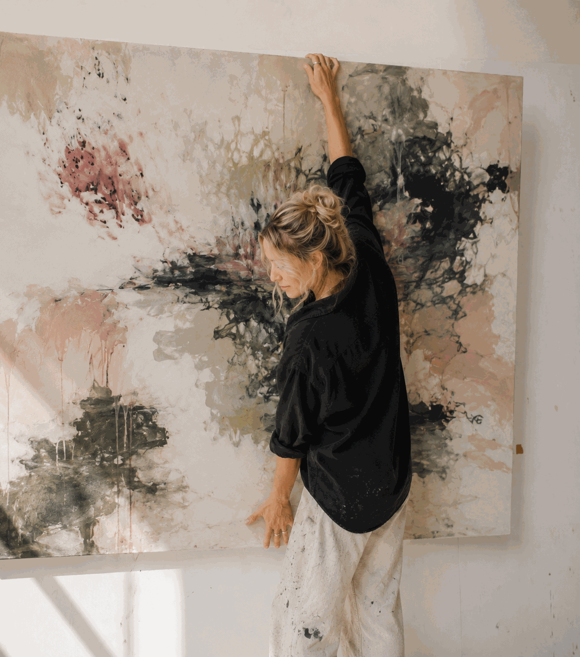
Alexander Kleinberg trained at an art academy in Düsseldorf before relocating to New York in his late twenties, drawn by the city's history of large-scale, gestural abstraction. Nearly two decades on, his physical, layered paintings — built in deep, deliberate palettes — remain some of the most collected work on artfables. We sat down with him to talk about process, darkness, and why he still thinks in German. artfables: You trained formally in Düsseldorf before moving to New York. How did that move change the way you paint? Kleinberg: It didn't happen overnight. My training in Düsseldorf was rigorous — very structured, very European. You learn control first, instinct second. New York flipped that order for me. I found this looser, more physical energy here, this history of painters who worked from the whole body, not just the wrist. It took me a few years to let go of some of that early discipline. I still think in German sometimes when I'm planning a piece, but I paint in English. artfables: Your work is often described as physical. What does that actually look like in the studio? Kleinberg: I don't sit. I don't work from one fixed spot. I paint standing, moving around the canvas, sometimes circling it for a while before I make a mark. The whole body is part of it — the reach, the weight behind a stroke, the distance I step back to look. A painting builds through a lot of layering and reworking. It finds its own balance eventually, but only after I've fought with it a bit. artfables: Your palette leans dark. What draws you there? Kleinberg: People assume dark means dramatic, or moody on purpose. That's not really it for me. I work with darker tones because that's where I find the most honest color. Black isn't empty — it's every color that hasn't decided what it wants to be yet. When you spend real time with one of my paintings, your eyes adjust. You start seeing what's underneath. That's the part I'm actually interested in — not the absence of light, but what's still visible once you give it a moment. artfables: Do you know when a piece is finished, or does something tell you? Kleinberg: It's more that the fighting stops. Early on, a canvas resists you — you put down a layer, it's wrong, you rework it, it's still not settled. At some point it stops pushing back. That's usually when I know to put the brush down, even if I can't always explain why. artfables: Is there a painting that changed something for you as an artist? Kleinberg: There's usually one a year that does that — teaches me something I didn't know I needed. I won't pretend I can always name it in the moment. Usually I only recognize it a few pieces later, looking back and seeing where the shift happened. artfables: What do you hope someone feels standing in front of your work? Kleinberg: I'm not trying to hand someone a feeling. I'd rather they find their own. If a painting holds someone's attention a little longer than they expected, and they're still noticing new things in it a year after they've hung it, that's the whole goal. artfables: Any advice for someone building a collection, especially if they're drawn to darker work? Kleinberg: Don't rush past it because it takes more effort. Lighter work is easier to like quickly. Darker work asks you to spend real time with it before it gives anything back. If you're willing to do that, it tends to reward you more in the long run than something that gave you everything on the first look.
Learn more
How to Choose Wall Art for Your Living Room
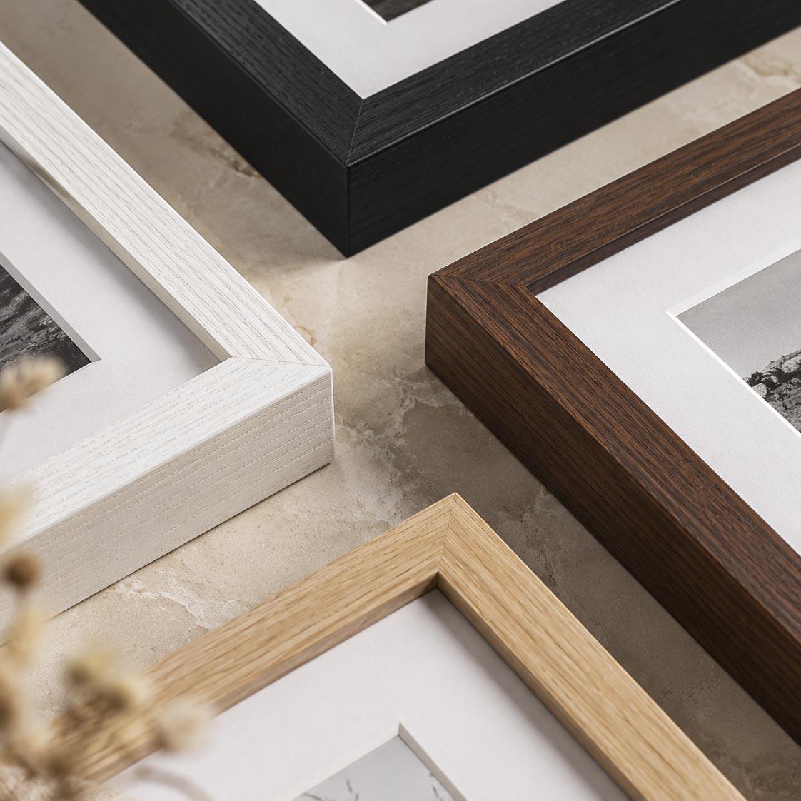
Choosing art for a living room often goes wrong for one simple reason: people start with colour. They look at the sofa, rug and cushions and search for artwork containing precisely the same shades. It can work. But it can also make art feel like another furnishing. A better starting point is scale, feeling and the artwork itself. Start with the wall Before thinking about style, look at where the artwork will live. A large empty wall above a sofa behaves differently from a narrow space beside a fireplace. Ask yourself whether the wall needs: one substantial artwork; a pair of complementary works; a gallery wall; or a smaller piece surrounded by breathing space. A common mistake is choosing artwork that is simply too small. If a framed print appears to float awkwardly in the middle of a large wall, moving it five centimetres won't solve the problem. The artwork probably needs more scale. Don't match everything Your artwork can relate to your room without matching it. A blue sofa doesn't require blue art. Instead, consider whether the artwork creates the kind of atmosphere you want. Soft abstract pieces can bring calm to a busy room. Strong geometric work can introduce structure. Expressive paintings can add movement to restrained interiors. Figurative work can give an otherwise minimal room personality. Consider a large statement piece Large wall art works particularly well above sofas because it gives the eye a clear focal point. Rather than filling a large wall with numerous decorative objects, one strong artwork can make the entire room feel more deliberate. And large doesn't necessarily mean loud. A substantial neutral or monochrome artwork can have considerable visual impact without introducing strong colour. Think beyond trends Interiors change. Sofas are replaced. Walls are repainted. Cushions disappear remarkably quickly. Good art should be able to survive those changes. So rather than asking: “Does this match my living room?” try asking: “Would I still want this if my living room changed?” That is a much better test. Framed or unframed? Framed art generally creates a more finished architectural presence, particularly in living rooms. Frame colour can either create contrast or allow the artwork to sit quietly within the room. Black frames tend to feel graphic and defined. Pale timber can feel softer. White frames reduce visual weight. Darker wood can introduce warmth. The artwork should ultimately make the decision easier. Choose art you want to keep looking at A living room is somewhere you spend a lot of time. The artwork doesn't need to impress everyone who visits it. It needs to continue being interesting to you. That might mean a restrained abstract composition, an expressive landscape or something strange enough that you still notice it six months later. That's the difference between filling a wall and collecting art. Explore Wall Art for Living Rooms
Learn more
A Guide to Pop Art: History, Icons, and What to Look For as a Collector
Few art movements are as instantly recognisable — or as widely misunderstood — as pop art. Bright colour, bold outlines, and imagery pulled straight from popular culture made it one of the most accessible movements in modern art history. But behind the recognisable visual language is a body of work that's more critical, more layered, and more collectible than its reputation as "commercial art" sometimes suggests. What Is Pop Art? Pop art is a movement that emerged in the mid-20th century, built around imagery borrowed from mass media, advertising, consumer products, and celebrity culture. Rather than rejecting commercial imagery as unworthy of fine art, pop artists embraced it directly — repurposing soup cans, comic strips, and mass-produced portraits as legitimate subject matter for painting and printmaking. At its core, pop art asked a provocative question: if a culture is saturated with mass-produced images, shouldn't art reflect that reality rather than ignore it? The result was work that felt immediate and familiar, while often carrying a sharp undercurrent of commentary about consumerism, celebrity, and repetition. A Brief History of the Movement Pop art developed roughly simultaneously in Britain and the United States during the 1950s and 60s, though the two scenes had distinct characters. The British movement leaned toward ironic, collage-based exploration of American consumer culture viewed from a distance. The American movement, centered largely in New York, embraced consumer imagery more directly — turning supermarket products, celebrity portraits, and comic book panels into large-scale paintings and prints. Key techniques associated with the movement include screen printing and other reproducible processes, which allowed pop artists to literally mimic the mass-production methods of the advertising world they were commenting on. This wasn't incidental — the process of making the work was often as much a part of the statement as the imagery itself. Defining Characteristics of Pop Art Bold, flat colour with minimal gradation, often mimicking commercial printing Recognizable, everyday subject matter — products, celebrities, comic imagery Repetition as both a technique and a commentary on mass production High contrast and graphic outlines, borrowing visual language from advertising and print media A tension between irony and celebration — pop art rarely tells you definitively whether it's critiquing consumer culture or reveling in it, and that ambiguity is part of its lasting appeal Why Pop Art Still Resonates With Collectors Pop art has aged unusually well for a movement so tied to a specific cultural moment, for a few reasons: It remains visually confident. Bold colour and graphic clarity read just as strongly in a contemporary interior as they did decades ago. It's inherently conversational. Pop art invites discussion — about culture, commerce, and meaning — in a way few movements do as naturally. Contemporary pop art continues to evolve, with current artists applying the movement's visual language to new subjects: social media, modern celebrity, digital culture, and consumerism in its current form. It pairs well within a broader collection. Because of its graphic clarity, pop art often works as a bold counterpoint to more subdued abstract or expressive pieces elsewhere in a collection. What to Look For When Collecting Pop Art Craftsmanship behind the simplicity. Pop art can look deceptively simple — evaluate colour precision, composition balance, and print quality closely. Concept, not just imagery. The strongest pop art pieces have a clear point of view, not just a recognisable subject. Edition quality, for prints. Since pop art has deep roots in printmaking, understanding the edition — numbering, print method, and certificate of authenticity — matters as much as the image itself. How it will live in your space. Pop art tends to read as a statement piece; consider giving it room to stand on its own rather than crowding it with competing decor. Frequently Asked Questions What's the difference between pop art and abstract art? Pop art centers on recognisable, culturally specific imagery — products, celebrities, media — while abstract art avoids recognisable subject matter entirely. They're often visually distinct but can share bold use of colour and graphic composition. Is pop art still being made today? Yes. Contemporary pop artists continue to apply the movement's core techniques and ideas to current cultural imagery, keeping the movement active and evolving rather than frozen in its mid-century origins. Why is pop art often created as limited edition prints? Printmaking has been central to pop art since its origins, partly because reproducible techniques echoed the movement's commentary on mass production. Limited, numbered editions allow that printmaking tradition to continue while preserving exclusivity for collectors. Is pop art a good starting point for new collectors? Its visual accessibility often makes pop art an approachable entry point, though the most collectible pieces reward the same scrutiny as any other movement — composition, concept, and quality of execution. How do I display pop art at home? Because of its graphic boldness, pop art generally works best with breathing room — a clean wall, moderate surrounding colour, and enough space for the piece's colour and contrast to stand out rather than compete with a busy backdrop.
Learn more
What Size Art Should Go Above a Sofa?
What Size Artwork Should You Hang Above a Sofa? The wall above a sofa is one of the most common places to hang artwork—and one of the easiest places to choose something too small. The goal isn't to fill every centimetre of wall. It is to make the sofa and artwork feel visually connected. Why scale matters A sofa is a substantial piece of furniture. Place a very small artwork above it and the two objects can look disconnected. The artwork appears to float rather than anchor the space. Increasing the size immediately gives the composition more presence. This doesn't necessarily mean choosing the largest artwork available. It means choosing a piece with enough visual weight for the furniture below it. One artwork or several? For a clean contemporary room, one large framed artwork is often the simplest solution. It creates a clear focal point and allows the art itself to command attention. A pair can work beautifully above a wider sofa, especially when the artworks share a visual relationship. A gallery wall works when you want something more informal and collected, but it requires greater attention to spacing and composition. Think about the frame too Remember that the dimensions of an art print aren't necessarily the final dimensions on your wall. Mounting and framing add size. That can actually help when you're trying to give an artwork more presence above large furniture. Before ordering, check the finished framed dimensions rather than looking only at paper size. Landscape, portrait or square? A landscape-format artwork naturally follows the horizontal line of a sofa and is often the easiest choice. But it isn't the only one. A large square piece can look particularly strong above a compact sofa. Two portrait works side by side can create similar width while introducing vertical movement. The composition of the artwork matters just as much as the shape of the frame. Give the artwork breathing room Large art doesn't mean covering the entire wall. Negative space around a piece helps establish its importance. A substantial artwork surrounded by clean wall space can feel far more considered than several smaller pieces added simply because there was room. Measure before you buy Use masking tape to mark the proposed artwork dimensions directly on the wall. Live with the outline for a few hours. Stand at the entrance to the room. Sit on the sofa. Look at it from the adjoining space. You'll understand the scale far more easily than you will from dimensions written on a product page.
Learn more
What Is a Limited Edition Print? A Collector's Guide
The term "limited edition" gets used loosely — stamped on posters, home goods, even mugs. In the art world, it means something specific, and understanding that distinction is one of the most useful things a new collector can learn. The definition that matters If you've ever seen an art print marked 12/150 or 48/100, you've encountered a limited edition. Unlike an open-edition print that can continue to be reproduced indefinitely, a limited edition is produced in a predetermined quantity. Once that edition has been completed, no further prints should be produced as part of that edition. A true limited edition print is produced in a fixed, predetermined run — say, 150 copies — and once that run is complete, it is never reproduced again. No reprints, no "part two," no quiet extension of the run if demand is high. The number is a promise, not a marketing figure. Each print in the run is individually numbered, typically written as a fraction: 24/150 means the 24th print pulled from a total run of 150. Prints are usually signed by the artist by hand, and often accompanied by a certificate of authenticity confirming the edition size, the medium, and the artist's signature. Are limited edition prints signed? Many are. A signed limited edition creates a more direct relationship between the physical print and the artist who created the work. At artfables, limited edition prints are individually numbered and accompanied by a certificate of authenticity, with editions closed once they have sold out. How this differs from an open edition An open edition print has no cap. It can be produced indefinitely, for as long as there's demand — which is exactly what makes it inexpensive, and exactly what it will never be scarce. Open editions are perfectly good decorative prints. They are not, in any meaningful sense, collectible in the way a numbered, closed run is. The difference isn't really about exclusivity for its own sake. It's about permanence. A limited edition is a fixed object in time — the artist made a decision about how many would ever exist, and stood by it. What determines a limited edition's value A few factors matter more than others: Run size. A run of 25 behaves differently than a run of 500. Smaller runs tend to hold and grow in value more predictably, simply because there is less supply to satisfy demand. The artist's ongoing body of work. Editions from artists who continue to develop and show new work tend to matter more over time than one-off releases from artists who never produce again. Print number, sometimes. Early numbers in a run occasionally carry a small premium, particularly for hand-pulled processes where the earliest prints are closest to the artist's original intent — though this matters less than people assume. Condition and documentation. A print with its original certificate of authenticity, kept out of direct sunlight and handled properly, will always be worth more than one without provenance. What to ask before you buy Any seller offering a genuine limited edition should be able to tell you, without hesitation: the total run size, the print number of the specific piece, the medium and paper or canvas used, and whether a certificate of authenticity is included. If those answers are vague, treat the "limited edition" label with real skepticism. A numbered print is a small kind of promise — that what you're buying is one of a fixed, finite few, and will stay that way. That promise is the whole point.
Learn more
What Is Expressive Art? Understanding Emotion-Driven Painting
Some paintings ask you to look. Expressive art asks you to feel first and look second. It's one of the most emotionally direct categories in painting — and one of the most frequently confused with abstract art. Here's what expressive art actually means, where it comes from, and why collectors keep returning to it. What Is Expressive Art? Expressive art — often called expressionism — is work created to convey emotion and inner experience rather than to accurately represent the outside world. The subject matter can be figurative (a face, a body, a landscape) or fully abstract; what defines the category isn't the presence or absence of a recognisable subject, but the priority given to feeling over precision. In expressive painting, distortion, bold colour, energetic brushwork, and dramatic composition aren't flaws — they're the point. A face might be elongated or exaggerated. A sky might be a colour no sky has ever actually been. The goal isn't accuracy; it's impact. Expressive Art vs. Abstract Art: What's the Difference? This is one of the most common points of confusion, so it's worth being precise: Abstract art is defined by the absence of a recognisable subject. Expressive art is defined by an emphasis on emotional intensity, which can exist with or without a recognisable subject. A painting can be both — an abstract composition rendered with raw, emotional brushwork is both abstract and expressive. But a portrait rendered with distorted proportions and intense colour to convey anguish or joy is expressive without being abstract at all. The two terms describe different things: one is about subject matter, the other is about intent and execution. A Short History of Expressionism Expressive painting has roots stretching back through art history, but it crystallised as a defined movement in the early 20th century, when artists across Europe began prioritising psychological and emotional truth over naturalistic representation. The movement later found new life in mid-century American painting, where large-scale, gesture-driven canvases turned the act of painting itself into an expressive event — every mark on the canvas a record of the artist's emotional and physical state in the moment of creation. That lineage continues today. Contemporary expressive artists still work in this tradition, using colour, mark-making, and composition to translate feeling directly onto the canvas. Why Expressive Art Resonates With Collectors It feels honest. Expressive work doesn't try to flatter or decorate — it communicates something real, which is part of why it holds up to repeated viewing. It changes with you. A piece that reads as energetic on one day might read as melancholic on another, depending on what you bring to it. It's deeply personal to collect. Choosing an expressive piece is less about matching a room and more about connecting with a specific emotional register — which is exactly why collectors often describe expressive pieces as the ones they feel most attached to. What to Look For When Collecting Expressive Art Emotional resonance first. Notice your immediate, pre-analytical reaction to the piece. Technical confidence. Expressive work can look loose, but skilled expressive painting has clear control beneath the apparent spontaneity — colour choices, mark-making, and composition all working together. Consistency with the artist's broader body of work. Understanding an artist's creative philosophy and process helps contextualise a single piece within their larger practice. Scale and presence. Expressive work often benefits from room to breathe — consider how the piece will command space, not just fill a wall. Frequently Asked Questions Is expressive art the same as expressionism? Yes — "expressive art" and "expressionism" are generally used interchangeably to describe work that prioritises emotional communication over realistic representation. Can expressive art be figurative? Absolutely. Expressive art can depict a person, place, or object — what makes it expressive is the emotional intensity and stylistic distortion applied to that subject, not whether a subject exists at all. What makes expressive art different from realism? Realism aims for visual accuracy. Expressive art intentionally departs from accuracy — through colour, proportion, or brushwork — to communicate feeling rather than replicate appearance. Why do collectors gravitate toward expressive pieces? Because they tend to form a more personal, immediate connection than technically "neutral" work. Collectors often describe expressive paintings as the pieces in their collection that feel the most alive. How do I choose an expressive painting for my home? Start with emotional response rather than colour-matching. Expressive work is meant to be a focal point — choose a piece that resonates first, then consider how the space around it can support that energy. Discover original expressive paintings and limited edition prints from the artfables collection.
Learn more
Size Doesn't Matter: Why a Curated Piece Will Always Outlast a Big, Cheap Canvas
There is a certain kind of purchase that feels satisfying in the moment and forgettable within a year. An oversized canvas print, chosen because it fills a wall and costs little to do it, is one of the most common examples in home design. It solves a problem — the blank space above the sofa — without ever asking a more interesting question: what do you actually want to live with? At artfables, we believe that question is worth asking. And we believe the answer is rarely "whatever is biggest and cheapest." The Illusion of Scale Large-format canvas prints are appealing for an obvious reason: they make an immediate visual statement. A six-foot-wide piece commands a room in a way a modest 16x20 cannot, at least not on first glance. But scale is not the same as quality, and a large empty gesture is still empty. Most of these prints are not created by an artist with a point of view. They are stock imagery, licensed in bulk, printed on demand, and shipped from large-volume manufacturing facilities — a significant share of them overseas, optimised for cost and speed rather than craft. The canvas is thin. The inks fade unevenly, often within a few years of normal sunlight exposure. The stretcher bars warp. There is no edition, no numbering, no artist to speak of — because the image was never meant to be collected. It was meant to be sold in volume and replaced without much thought. That's not a flaw in any single product. It's the entire model. Volume and permanence are opposing goals, and when a business is built around the first, the second is the first thing to go. What Curation Actually Buys You Choosing a curated piece — an original painting or a strictly limited edition print — is a different transaction entirely. It buys you intention. A curated piece has passed through a filter: an artist's eye, a considered composition, a reason for existing beyond decorating a wall. When you choose it, you're not filling space. You're making a decision about what you want to look at every day, and why. It buys you durability. Work produced in small runs, on archival materials, with attention to pigment and process, is built to be lived with for decades — not replaced when the color shifts or the corners fray. A well-made piece on the right substrate, framed and cared for properly, can outlast the room it's hanging in. It buys you scarcity that means something. A limited edition — numbered, capped, never reprinted once the run is closed — has a ceiling on how many exist in the world. That's not a marketing device. It's a structural fact that shapes the piece's meaning and its value over time. A print that anyone can reorder indefinitely is not scarce; it's simply inventory. It buys you a story. Every piece in a considered collection connects to a person — a working artist with a process, a perspective, and a body of work it belongs to. That context is part of what you're bringing into your home. A factory print has no such story, because there was never anyone to tell it. A Smaller Piece, Chosen Well, Beats a Large Piece Chosen Carelessly This is worth saying directly: a well-chosen 20x24 original will do more for a room — and hold its value and integrity longer — than an oversized print bought to solve a spatial problem. Scale can absolutely be part of a considered choice; large-format originals and editions have their place, and can anchor a room beautifully. But size should follow the decision to collect something meaningful, not substitute for it. The difference shows up over time. A curated piece tends to become more interesting to live with, not less — you notice new things in it a year in, five years in. A decorative print, by contrast, tends to fade into wallpaper almost immediately, precisely because it was never asking to be looked at closely in the first place. Supporting the Artist Behind the Work There's also a simpler case to be made, separate from questions of longevity or aesthetics: when you buy a curated original or limited edition, you are supporting an artist's practice directly. That purchase has a place to land — it funds the next body of work, sustains a career, and keeps the work of building a distinct creative voice viable. A mass-produced print, licensed once and reproduced indefinitely by a manufacturer, does none of that. The economics simply don't run in that direction. Collecting, at its best, is a quiet form of patronage. It says: this perspective is worth continuing. What to Look For When Choosing a Piece If you're moving away from decorative prints and toward a more considered approach to art in your home, a few things are worth paying attention to: Edition size and numbering. A true limited edition states how many exist and where a given piece falls in that run. If a "limited" print can be reordered at any time, it isn't actually limited. Certificate of authenticity. This is standard practice for both originals and legitimate limited editions, and it matters for provenance and future value. Materials. Archival paper, artist-grade pigments, and proper canvas or panel construction are the difference between a piece that lasts and one that doesn't. The artist's body of work. A single image tells you little. A consistent creative perspective across multiple pieces tells you the work comes from an actual practice, not a one-off asset. Fit with intention, not just wall space. Choose the piece first. Let the wall accommodate it — not the other way around. The Wall Above the Sofa Isn't the Point A home filled with curated work looks different from one filled with décor, even when the difference isn't immediately obvious to a visitor. It reads as considered. It ages well. And it tends to mean more to the person living with it, because it was chosen rather than defaulted into. Size was never really the question. The question is whether what's on your wall was made by someone, for a reason — or simply printed, in bulk, to fill it.
Learn more