

Choosing art for a living room often goes wrong for one simple reason: people start with colour.
They look at the sofa, rug and cushions and search for artwork containing precisely the same shades.
It can work. But it can also make art feel like another furnishing.
A better starting point is scale, feeling and the artwork itself.

Start with the wall
Before thinking about style, look at where the artwork will live.
A large empty wall above a sofa behaves differently from a narrow space beside a fireplace.
Ask yourself whether the wall needs:
- one substantial artwork;
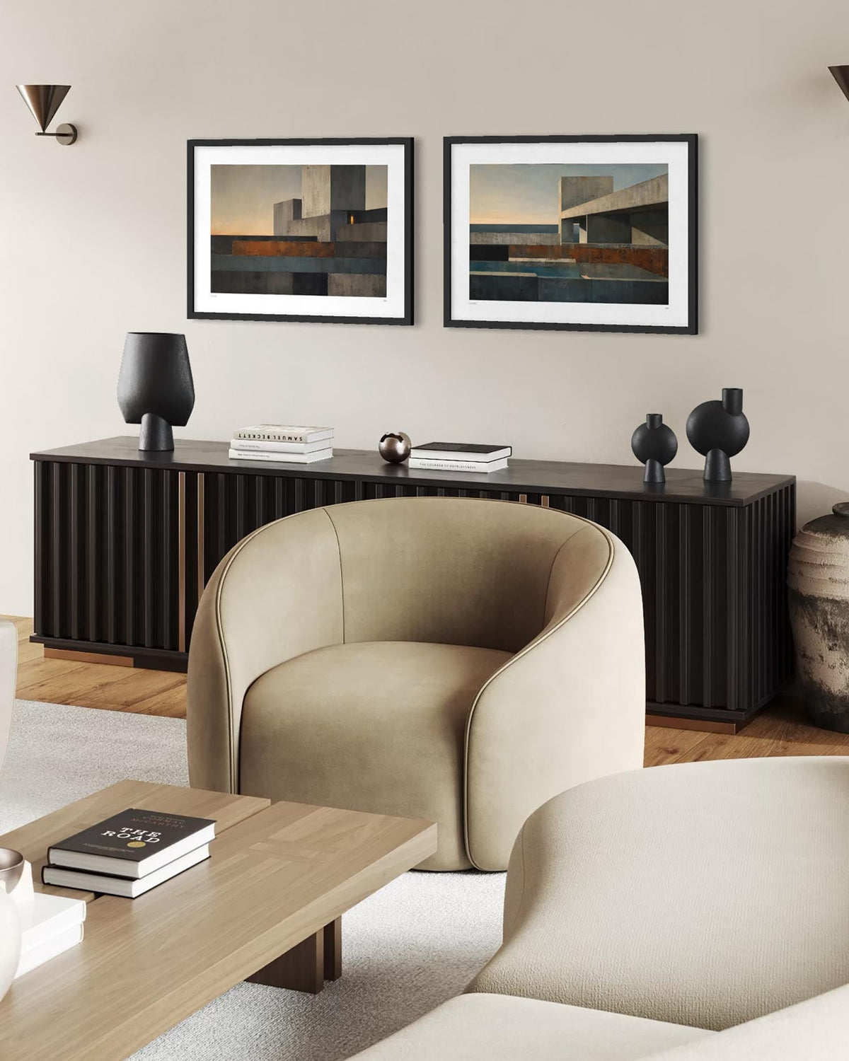
- a pair of complementary works;
- a gallery wall;
- or a smaller piece surrounded by breathing space.
A common mistake is choosing artwork that is simply too small.
If a framed print appears to float awkwardly in the middle of a large wall, moving it five centimetres won't solve the problem. The artwork probably needs more scale.
Don't match everything
Your artwork can relate to your room without matching it.
A blue sofa doesn't require blue art.
Instead, consider whether the artwork creates the kind of atmosphere you want.
Soft abstract pieces can bring calm to a busy room.
Strong geometric work can introduce structure.
Expressive paintings can add movement to restrained interiors.
Figurative work can give an otherwise minimal room personality.

Consider a large statement piece
Large wall art works particularly well above sofas because it gives the eye a clear focal point.
Rather than filling a large wall with numerous decorative objects, one strong artwork can make the entire room feel more deliberate.
And large doesn't necessarily mean loud.
A substantial neutral or monochrome artwork can have considerable visual impact without introducing strong colour.
Think beyond trends
Interiors change.
Sofas are replaced. Walls are repainted. Cushions disappear remarkably quickly.
Good art should be able to survive those changes.
So rather than asking:
“Does this match my living room?”
try asking:
“Would I still want this if my living room changed?”
That is a much better test.

Framed or unframed?
Framed art generally creates a more finished architectural presence, particularly in living rooms.
Frame colour can either create contrast or allow the artwork to sit quietly within the room.
Black frames tend to feel graphic and defined. Pale timber can feel softer. White frames reduce visual weight. Darker wood can introduce warmth.
The artwork should ultimately make the decision easier.
Choose art you want to keep looking at
A living room is somewhere you spend a lot of time.
The artwork doesn't need to impress everyone who visits it.
It needs to continue being interesting to you.
That might mean a restrained abstract composition, an expressive landscape or something strange enough that you still notice it six months later.
That's the difference between filling a wall and collecting art.